

Ant Design Navbar


Working on a recent React.JS project, I used Ant Designs to make my job an easy one, while the whole library is pretty awesome and easy to use one thing that I did not like was the lack of a responsive Navbar. The Menu component works well on Desktops/Laptops but not on smaller screens like Smartphones or Tablets.
Here's my take on solving this problem. Assuming you have Node.js installed on your system and have worked with React.JS before Let's start by creating a React App by
npx create-react-app navdemo
Once it's done installing the required packages and creating the basic boilerplate for our app, cd into the directory
cd navdemo
and install the Ant Design package
npm i antd
Once the package is installed, open your favorite IDE and let's start coding
Inside the src directory create another directory components and inside the components directory create a directory Navbar, this is where all our navbar components will go.
Inside the Navbar directory create 3 files Nav.js, Nav1.js, Nav2.js.
Inside Nav.js we'll create a container , that'll serve as the main body of our Navbar
and use the Drawer component from Ant-design to make our Nav responsive and inside Nav1.js, Nav2.js we'll have the Ant design Menu component, making the contents of our main body
Nav.js
import React, { useState } from "react";
import Nav1 from "./Nav1";
import Nav2 from "./Nav2";
import { Button, Drawer } from "antd";
import { MenuOutlined } from "@ant-design/icons";
const Nav = () => {
  const [visible, setVisibe] = useState(false),
    [key, setKey] = useState("1");
  return (
    <nav className="navbar">
      <div className="logo">LOGO</div>
      <div className="nav-container">
        <div className="left-nav">
          <Nav1 key={key} setKey={setKey} />
        </div>
        <div className="right-nav">
          <Nav2 key={key} setKey={setKey} />
        </div>
        <Button className="btn" onClick={() => setVisibe(true)}>
          <MenuOutlined />
        </Button>
        <Drawer
          title="LOGO"
          placement="right"
          closable={false}
          onClose={() => setVisibe(false)}
          visible={visible}
        >
          <Nav1 key={key} setKey={setKey} />
          <Nav2 key={key} setKey={setKey} />
        </Drawer>
      </div>
    </nav>
  );
};

export default Nav;
Nav1.js
import React from "react";
import { Menu, Grid } from "antd";
const { useBreakpoint } = Grid;
const Nav1 = ({ key, setKey }) => {
  const { md } = useBreakpoint();
  return (
    <Menu
      mode={md ? "horizontal" : "inline"}
      onClick={(e) => setKey(e.key)}
      selectedKeys={[key]}
    >
      <Menu.Item key="1">Item 1</Menu.Item>
      <Menu.Item key="2">Item 2</Menu.Item>
      <Menu.Item key="3">Item 3</Menu.Item>
    </Menu>
  );
};

export default Nav1;
Nav2.js
import React from "react";
import { Menu, Grid } from "antd";
const { useBreakpoint } = Grid;
const Nav2 = ({ key, setKey }) => {
  const { md } = useBreakpoint();
  return (
    <Menu
      mode={md ? "horizontal" : "inline"}
      onClick={(e) => setKey(e.key)}
      selectedKeys={[key]}
    >
      <Menu.Item key="4">Item 4</Menu.Item>
      <Menu.SubMenu title="Dorpdown" key="5">
        <Menu.Item key="5:1">Drop Item 1</Menu.Item>
        <Menu.Item key="5:2">Drop Item 2</Menu.Item>
      </Menu.SubMenu>
    </Menu>
  );
};

export default Nav2;
App.css
@import "~antd/dist/antd.css";

.navbar {
  width: 100vw;
  padding: 0 2rem;
  background-color: #fff;
  z-index: 3;
  height: 3.5rem;
  display: flex;
  justify-content: center;
  align-items: center;
  border-bottom: 2px solid rgb(230, 228, 228);
}
.logo {
  float: left;
  font-size: 2rem;
}
.nav-container {
  width: calc(100% - 6rem);
  float: left;
  vertical-align: middle;
}
.left-nav {
  float: left;
}
.right-nav {
  float: right;
}
.btn {
  float: right;
  height: 3rem;
  padding: 0.5rem;
  margin-top: 0.5rem;
  display: none !important;
  background: none;
  color: black;
  border: none;
  font-size: x-large;
}
.ant-menu-horizontal,
.ant-menu-inline {
  border: none;
}
@media (max-width: 767px) {
  .btn {
    display: inline-block !important;
  }
  .left-nav,
  .right-nav {
    display: none;
  }
  .nav-container {
    width: calc(100%-5rem);
    float: left;
  }
}
After you're done with making your navbar, Lets not forget to import it in our App.js file.
App.js
import "./App.css";
import Nav from "./components/Navbar/Nav";
function App() {
  return (
    <div className="App">
      <Nav />
    </div>
  );
}

export default App;
And you're ready to use that Navbar you just created in Your React project now!
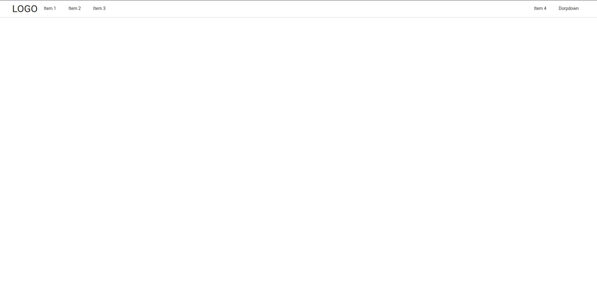
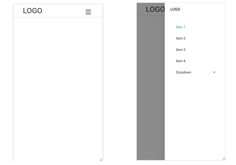
Preview
Desktop View
Mobile View
Checkout the Working code here
Thanks For Reading!